School-Designed Academic Argumentation Anchor Charts
Overview
One instructional technique that has taken off this year at Argument-Centered Education partner schools is the use of the anchor chart. These have often been teacher-created, sometimes they’ve been the work of departments or a leader or team working on behalf of the whole school. Anchor charts have become an integral part of argument-centered instruction across the ACE network.
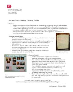
Anchor charts are informational posters, including guidelines, procedures, or performance criteria that help students establish rigorous and effective literacy or numeracy routines for application in classroom work. EngageNY has an excellent set of general suggestions when creating anchor charts.
Argument-Centered Anchor Chart Exemplars
One argument-centered anchor chart exemplar was produced by teachers at the Peirce School of International Studies in Chicago. This anchor chart lists out strategies for generating counter-arguments, and is even designed to offer students templatized counter-argument or refutation language. The imperative here was that students were unsure how to start when told to think critically about other students’ views expressed in seminars, discussions, or debates, and to try (when those views differed in some way from their own) to come up with counter-arguments or refutation statements. The anchor chart disaggregates this task into many “routes” toward critique, and provides some of the root language for responsive arguments. 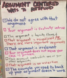 In a classroom context this exemplar is hung next to argumentation posters that we provided.
  Another exemplar comes from James H. Bowen High School, also in Chicago. The instructional leadership team at Bowen wanted to address the confusion that arises when students encounter argument language across disciplines that is similar but not the same, or when (as is often the case) people outside their school walls people use the language of argument less precisely. We work with partner schools to coalesce around a common language and set of terms, to aid students’ assimilation of the skills of academic argument and to help them see the fundamentally common infrastructure that underlies academic work, but that process does not and cannot result in perfect semantical uniformity. Thus the “Same Idea, Different Word” anchor chart.
 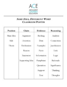 The words were chosen carefully to ensure that the poster removed, and didn’t add to, fuzziness or ambiguity around the terms and concepts of argument. We’re quite comfortable with this clarifying grid. And it hangs quite nicely next to our “Language of Argument” poster.
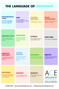 Visual learners can benefit from anchor charts in the classroom, but so can all learners — particularly when they are carefully constructed, focus on key ideas, highlight important routines, and are appealing to look at. If you design an argument-based anchor chart you like and works well, we’d love to see it and learn from it!

